Redesigning PMU’s Mobile Betting for a Fast, Frictionless Experience
PMU’s redesigned mobile website gives horse racing fans a seamless betting experience by simplifying race selection, bet placement, and navigation—making wagering quick and intuitive.
/client
PMU Brasil
/PRODUCT
Website
/When
2018


Pari Mutuel Urbain (PMU) is a prominent French organization specializing in horse race betting, both trackside and off-track. Their Brazilian subsidiary aimed to attract a broader audience by optimizing their mobile betting experience, specifically targeting users who watch races on television and prefer placing bets via mobile devices.
The previous mobile site lacked crucial features, such as mobile-optimized access to the "Raceday" section, leading to significant user frustration and high bounce rates.

UX Challenges
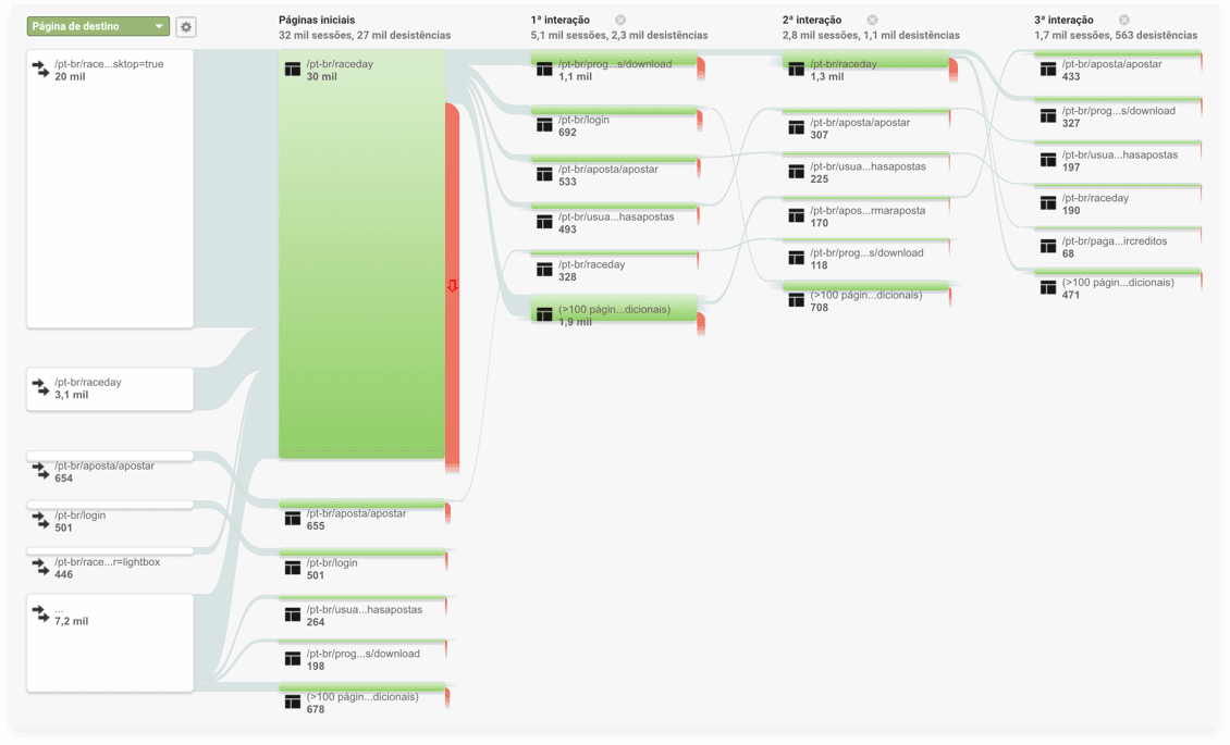
Through comprehensive user research and detailed analytics, we identified several critical pain points impacting user engagement:
Limited Mobile Optimization: The vital "Raceday" section was inaccessible on mobile, redirecting users to a desktop version and disrupting their experience.
Inefficient Race Selection: Users frequently landed on randomly selected races rather than their preferred racetrack, resulting in repetitive and frustrating navigation.
High Bounce Rates: Analytics indicated that approximately 90% of Android users exited the site upon encountering non-optimized pages.
Cluttered Interface: The betting screens contained excessive information, leading to usability and readability issues.
UX & Design Solutions
Prioritized Home Screen
Before
After
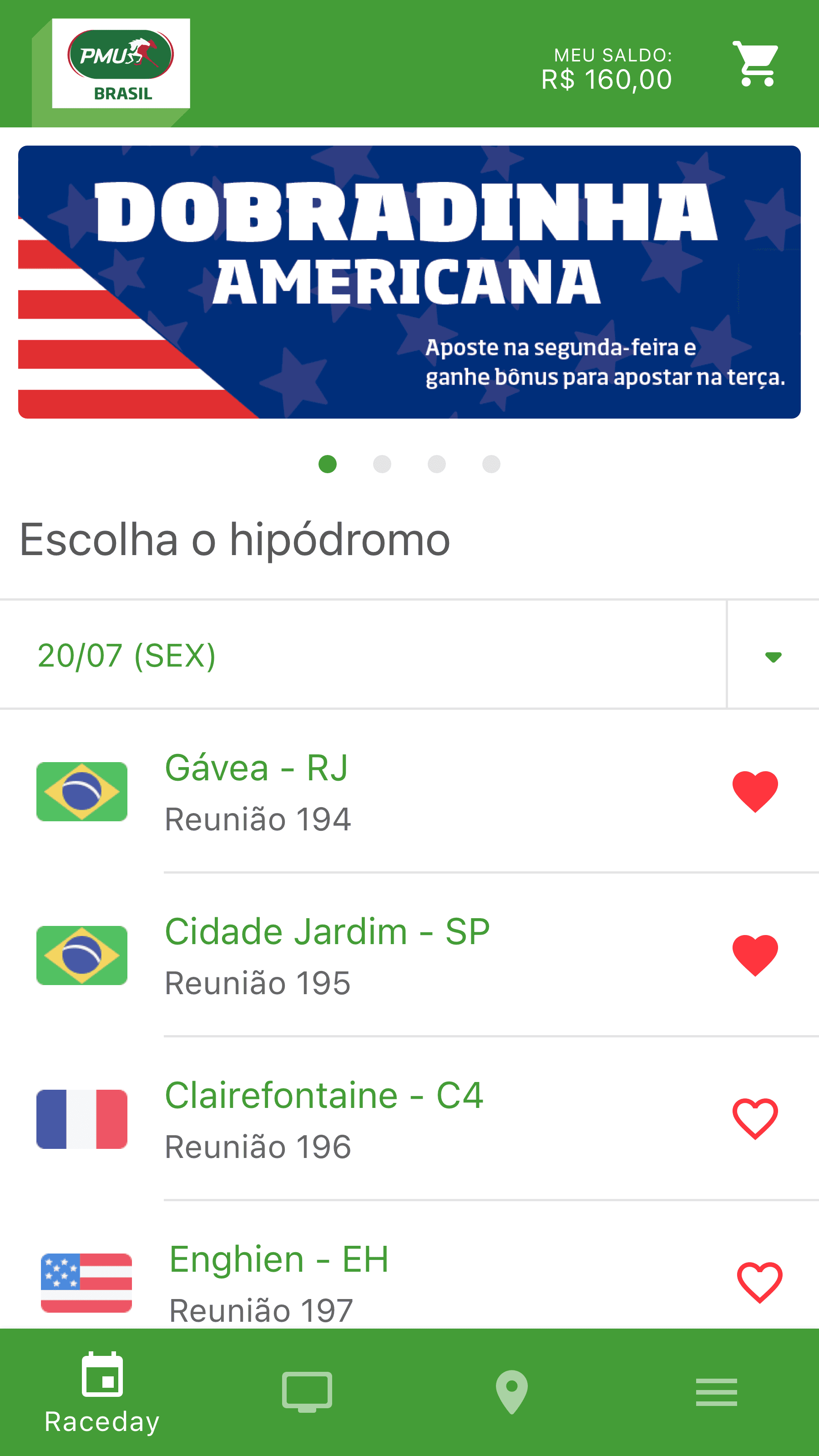
We restructured the home screen to feature the "Raceday" section prominently, enabling users to directly select their preferred racetrack, thus simplifying the navigation and reducing user frustration.
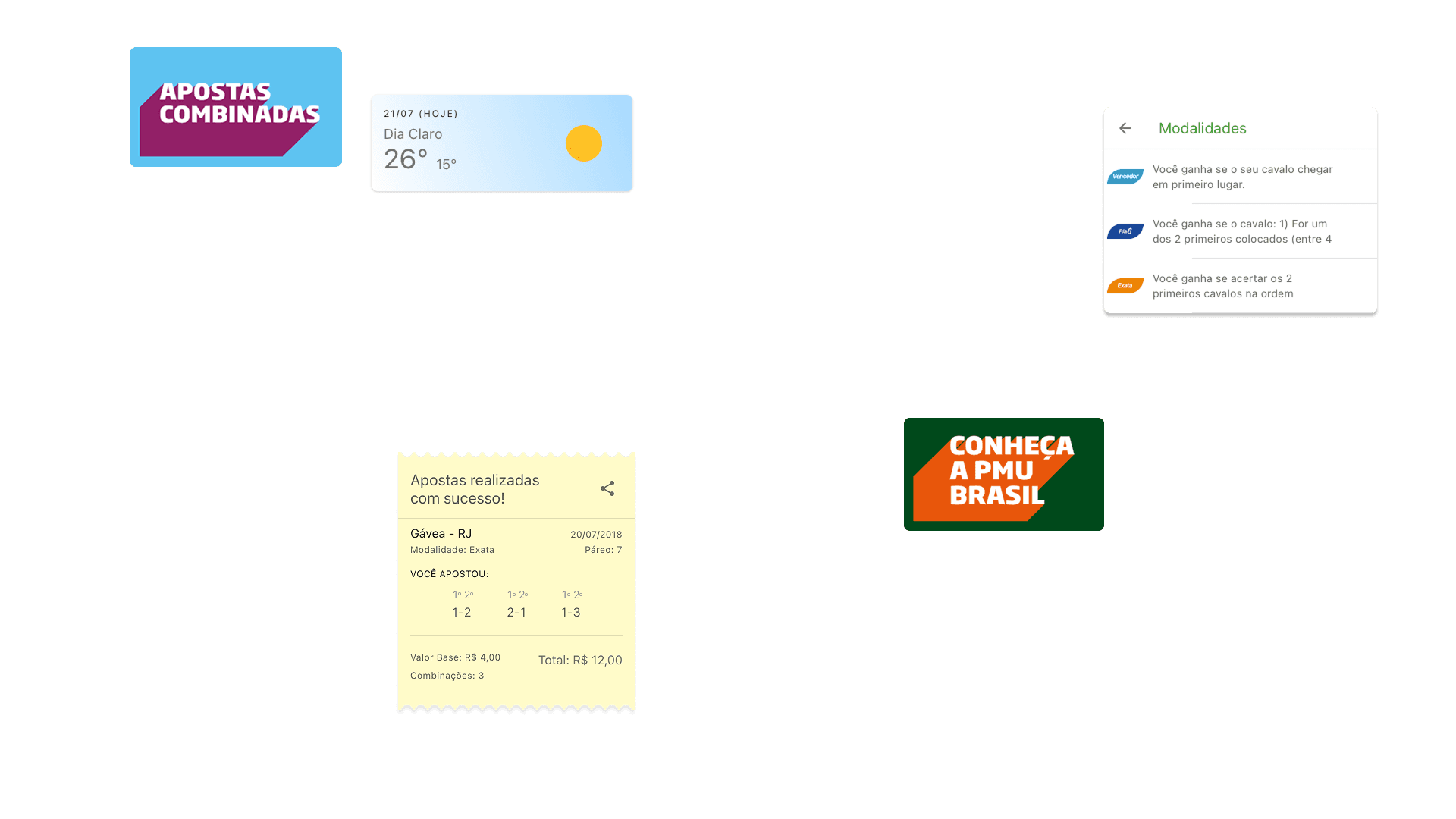
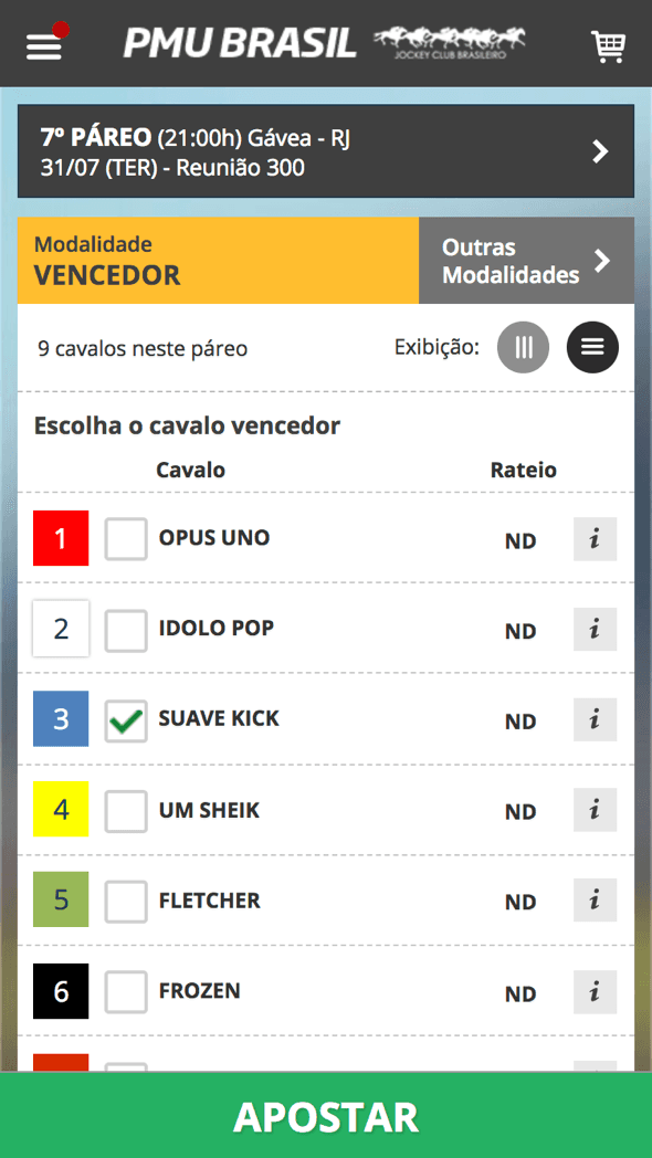
Streamlined Betting Interface
Before

After
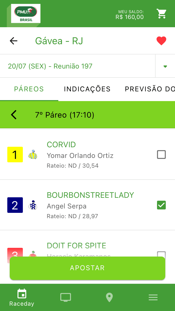
We enhanced readability and user focus by introducing additional white space and adjusting spacing between interface elements for improved clarity.
Improved Iconography
We replaced heavily embossed icons with a clean, flat design, ensuring legibility at small sizes.
Enhanced Shopping Cart Experience
Before

After
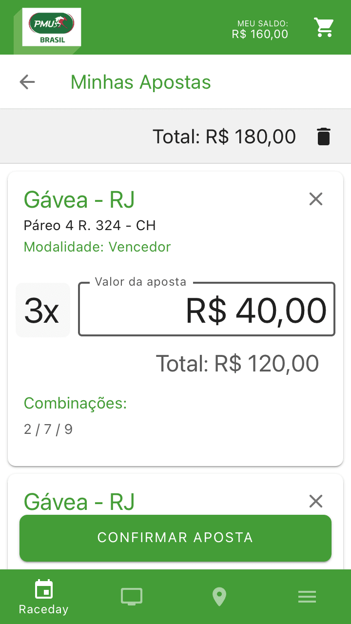
The shopping cart was redesigned to occupy the entire screen, providing clear and comprehensive visibility of betting details.
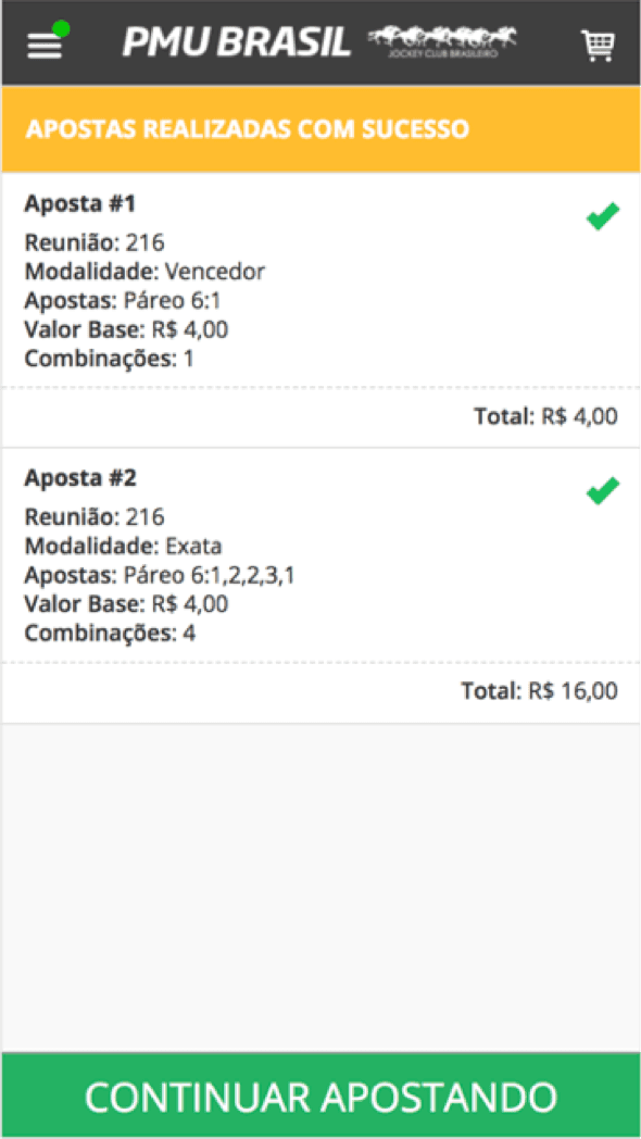
Clear Purchase Confirmation
Before
After
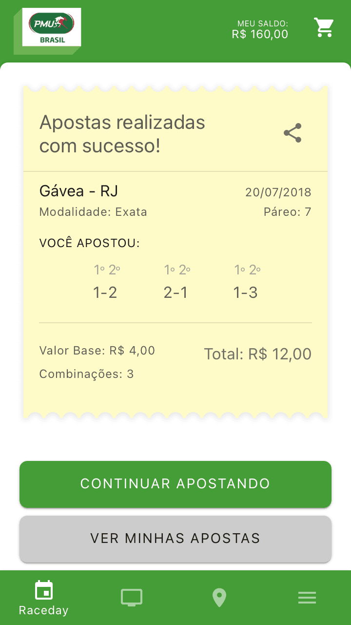
Confirmation screens were simplified with increased white space, and the layout was improved to clearly present bet combinations, enhancing overall readability.
Outcomes
While exact quantitative metrics were never shared with us, the redesigned platform led to:
Reduced bounce rates
Faster and more intuitive betting processes
Increased user satisfaction and engagement
Conclusion
By addressing critical UX issues and optimizing the user journey, we successfully delivered an intuitive, frictionless mobile betting experience tailored to horse racing enthusiasts. The enhancements significantly improved overall usability, providing users with an efficient and engaging betting process.